01
Good design is innovative
Innovation serves use — never novelty for its own sake.
Bevel Keys: Local vault + chamfer signature — not another purple cloud clone.
01 — Dieter Rams
We design like a good tool: useful, honest, and as little design as possible. Each Rams principle has a Bevel Keys rule of thumb.
01
Innovation serves use — never novelty for its own sake.
Bevel Keys: Local vault + chamfer signature — not another purple cloud clone.
02
Primary functions first; strip anything that doesn’t help.
Bevel Keys: Unlock, find, fill, backup — one job per Settings pane.
03
Beauty comes from clarity and proportion, not decoration.
Bevel Keys: Graphite + steel + one copper signal. IBM Plex, not display fonts.
04
Structure should explain itself.
Bevel Keys: Same field boxes on Login, Card, Misc Info; honest backup copy.
05
Products are tools — they leave room for the user’s content.
Bevel Keys: Chrome stays quiet; vault data is the hero.
06
Don’t promise what you can’t deliver.
Bevel Keys: “On your Mac” — no fake sync theater on the homepage.
07
Avoid fashion that ages overnight.
Bevel Keys: Chamfer + copper endure; skip trend gradients and glow stacks.
08
Care shows in small things.
Bevel Keys: Focus rings, selection color, equal icon columns, Escape vs Return.
09
Conserve resources — including attention.
Bevel Keys: Local-first: no mandatory cloud account or sync servers to babysit.
10
Back to purity — less, but better.
Bevel Keys: One accent. One cut. Merge duplicate buttons. Cut redundant copy.
02 — Logo
Cream tile, charcoal keyhole plate, one beveled corner with a copper indicator. Files: bevel-keys-mark.svg, bevel-keys-logo.svg.


03 — Icons & assets
Mac app icons, Chrome/Brave extension icons, Open Graph art, and the homepage product shot.
/assets/brand/appicon/





/assets/brand/extension/




Inline SVG strokes on copper.
04 — Light & dark
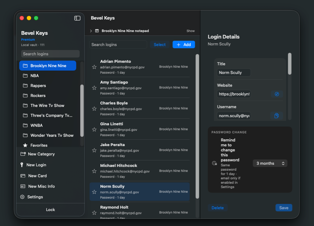
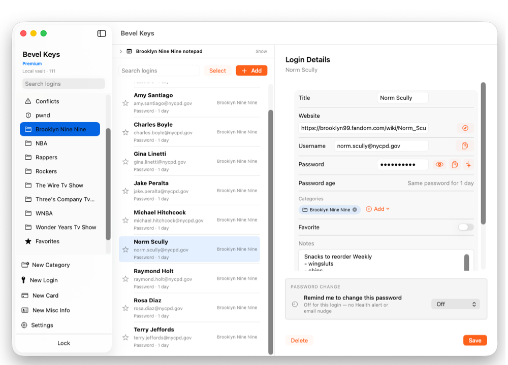
Dark (ink) is the default marketing and instrument body. Light (paper) is the warm inset — app-like chrome, paper sections, print-friendly lockups. Copper stays the signal in both.
Dark · website default
Light · paper / app chrome
| Role | Dark | Light |
|---|---|---|
| Background | --ink #121310 | --paper #F1EAE0 |
| Panel | --ink-2 #171814 | --paper-2 #E7DFD1 |
| Heading | --text-1 #F4F1EA | --paper-ink #201E19 |
| Body | --text-2 #C7C9C2 | #4A463D |
| Accent | --copper #FF7A3D | --copper-2 #E35F22 |
| Hairline | --line #34362E | --paper-line #D3C9B6 |
05 — Color
Dark instrument by default. Paper sparingly. Copper is the only loud signal — CTAs, eyebrows, focus, selection.
06 — Typography
IBM Plex Sans for UI and headings. IBM Plex Mono for eyebrows, nav brand, step labels, tokens.
Display / H1 · Plex Sans 650
Passwords that stay on your Mac
Body · Plex Sans 400 · 1rem / 1.6
Bevel Keys keeps your logins in an encrypted vault on your computer — no Bevel Keys account to babysit.
Eyebrow · Plex Mono 500 · tracked uppercase
Local-first password manager for Mac
07 — Chamfer
Buttons, panels, and cards clip one top-right corner. Default --bevel: 18px; small --bevel-sm: 10px.
Prefer clip-path bevels over large border-radius stacks. Do not mix full-round pills with chamfered CTAs on the same surface.
08 — UI kit
Reuse site classes for marketing. Product screens mirror the same copper signal, visible fields, and quiet chrome — in light or dark.
Hairline border, ink-2 fill, single chamfer. Feature callouts and pricing tiles.
Paper inset
Invert the instrument: cream ground, dark type, copper-2 eyebrows.
On-paper buttonSame structure in both themes: tabs, labeled fields with visible boxes, list rows, banners, primary + ghost actions.
Dark UI
Title
Website
Username
Password
Light UI
Title
Name on card
Number
Security code
09 — Voice
Product name: Bevel Keys (two words, title case). Never “BevelKeys” in UI copy.
Tone: Direct, calm, technical enough for builders. Prefer “on your Mac” over cloud theater.
Avoid: Growth-hack urgency, emoji clusters, “AI-powered,” purple gradients, Inter/Roboto as brand fonts.
10 — Token index
Layout: --max: 1180px, --gutter: 32px, spacing --sp-1…--sp-10.
| Token | Value | Use |
|---|---|---|
--ink | #121310 | Dark page background |
--ink-2 | #171814 | Dark panels |
--paper | #F1EAE0 | Light surface |
--text-1 | #F4F1EA | Dark headings |
--paper-ink | #201E19 | Light headings |
--copper | #FF7A3D | CTA / focus (dark) |
--copper-2 | #E35F22 | CTA / eyebrow (light) |
--font-display | IBM Plex Sans | UI + headings |
--font-mono | IBM Plex Mono | Labels / brand text |
--bevel | 18px | Default chamfer |
Assets: /assets/brand/ · Styles: /assets/css/style.css · Rebuild: python3 website/build.py · Open: /brand/